Tuesday, April 3, 2012

Planimetric Map


Here is a planimetric map which can be seen as only the horizontal positions of features are displayed, without regard to elevation.  This differs from a topographic map which indicates both horizontal and vertical positions.

In this example, we are examining Iraq.  It shows us international boundaries, major cities, transportation routes (including roads and railroads), air fields, water boundaries and oil refineries.

Topographic Map


McGraw-Hill Science & Technology Dictionary defines a topographic map as being large-scale in size showing relief and man-made features of a portion of a land surface distinguished by portrayal of position, relation, size, shape and elevation of the features.

Here, we can see an example of this as shown by a topographic view of the state of Florida.  As you can see by the full state being visible, there is a large area to cover in regards to dimension and depth being examined in the bottom left corner of the image.

Thematic Map


A thematic map is one that displays the special distribution of an attribute that relates to a single topic, theme or subject of discourse.  Highlighting or employing different colors and patterns is a common defining factor.  These maps can also be used to display geographical concepts such as density, distribution, relative magnitudes etc.

In this example, we are observing the lower 48 states by range to see in detail what activities are wanted the most.  The shading begins light and increases in color towards a deeper red signifying more businesses.

Cadastral Map


Cadastral maps are common land administrative tools which are used by a broad range of people, public and professional.  It remains a great form of mapping because it shows all of the land parcels in relation to one another and adjoining roads.

As ancient as this may be, it is a wonderful tool as exemplified in this map of Australia.  Many cadastral maps consist of smaller cadastral plans as shown in this picture.  The red circle shows one specific plan that was included.

PLSS Map


The Public Land Survey System (PLSS) is the surveying method used historically over the largest fraction of the country to survey and spatially identify land parcels before designation of eventual ownership, particularly for rural, wild or undeveloped land.

In the picture above, we observe a small portion of Minnesota on a 1:100,000 scale quadrangle.  County, district and zoning rights are specifically established.

Hypsometric Map


A hypsometric map is a tool in topographic surveying which gives elevations by use of contours, shading, tinting or batching.  In this ma of the world, we are examining environmental zones through use of cross blending techniques.  Unique tinting variations allows for the transition that occurs when entering a new boundary.

Propaganda Map


A propaganda map is the creation of false maps with the goal of achieving a result similar to traditional propaganda.  These are generally flat surfaces.  In the example above, we see a parody of the inner workings of what one would argue is the Republican mindset.  This is a method of propaganda because it is not an accurate view of the mind of Ronald Reagen, but rather what liberals view of him is.

Dot Distribution Map

http://blog.chicagohistory.org/index.php/2012/02/segregation-in-chicago/


A dot density map is a type of map that uses dot symbols to show the presence of a feature or phenomenon.  Dot maps rely on a visual scatter to show spatial pattern.  The map above is of specific areas of segregation in Chicago.  These ethnic divides are shown by different colored dots.  Red dots symbolize Caucasion, blue is for African Americans, green is for Asian, orange is Hispanic and gray is other.

Choropleth Map


McGraw-Hill Science & Technology Dictionary defines choropleth mapping as a map showing the distribution of a phenomenon, usually using various colors.  Color gradiations are correlated to the density per unit area of the phenomenon.

The map above displays the percentage of people in Florida that are Hispanic in each specific county based on the Census data 12 years ago.  These unequal groups are shown through different shades of green which darkens as the percentage increases.

Proportional Circle Map


A proportional circle map scales circle area to the total value for a geographic area on a map.  As seen in the map above of the western United States, there are proportional circles visible to illustrate the Indian population of each state.  The information was derived from the Census Bureau of 1990.

Cartogram Map


A cartogram map is a mapping variable which substitutes thematics for land area.  It is essentially a distorted map which exaggerates and/or shrinks countries during its substitution process.  In the above distorted view f the world, we see that the actual cartography is altered when attempting to demonstrate the proportion with each country’s size weighted to reflect the size of the population.

Statistical Map


A statistical map is a special type of map in which the variation in quantity of a factor such as rainfall, population, or crops in a geographic area is indicated.  The map above demonstrates the estimated travel time to work in the United States.  Colors range from green as the quickest, to a deep red signifying the longest.

Infrared Aerial Photo Map


http://sofia.usgs.gov/publications/fs/2004-3016/


Aerial photographs can be taken either vertically an each photo consists of several bands.  Infrared colors include red, green and blue light.  The map above is a color infrared image from an aerial angle of the southern points of Florida.  The study point is highlighted with red, depicting the Everglades.

Doppler Radar


Doppler radar uses the Doppler effect to measure velocity.  The above image if displayed courtesy of the National Weather Service Radar Image during Hurricane Andrew.  This Miami based report depicts wind speeds that devastated South Florida.

Black and White Aerial Photo

http://www.loc.gov/exhibits/911/911-maps.html


Thanks to a thermal sensor flown over Ground Zero following 9/11, we were able to capture this black and white aerial photo of the rubble.  This helped officials to determine accurate elevation data and mapping hot spots in order to monitor the progress of recovery and provide safety zones for everyone.

LIDAR Map


LIDAR stands for “light detection and ranging” which ultimately produces highly accurate three-dimensional data measurements that can then be utilized by mapping and other navigation systems.  The above image was used to show the solar hot spots of New York City through use of connected points in a three-dimensional manner.

Isobar Map


An isobar is a contour line of equal or constant pressure on a graph, plot or map.  The above photo uses this technique to map out specific weather pressures in the Willamette Valley.  The direction of rainfall and wind speed moves counterclockwise within a warmer climate control.

Isotach Map


http://wxmaps.org/pix/avnmr.00hr.html


An isotach is a line on a map that joins points of equal elevation.  On weather maps, these can depict wind speed, temperature gradients and weather fronts.  In the above picture, temperature, humidity and wind are being measured by color shading.  The lighter the shade means the lower the speed.

Isohyet Map


An isohyet line is a form of contouring which is a line joining points of equal precipitation on a map.  These connecting points are featured in the above image suggesting that the Australian drought was not caused by climate change.  This rainfall map of Australia is a prime example of an increasing proportion of rain the higher the elevation.

Isopach Map


According to McGraw-Hill, an isopach map is a map of the areal extent and thickness variation of a stratigraphic unit.  It is used in geological exploration for oil and for underground structural analysis.  The above isopach map depicts the thickness of the Earth’s crust in km.

Isopleth Map


An isopleth is a line drawn on a map through all points of equal value of some measurable quantity.  They can be compared to that of a choropleth map.  These connected geographical points are shown through the above example of noise variation at ground level.  This scaled measurement uses shading the depict hotter spots capable of attracting many ears, wanted or not.

DRG Map


DRG stands for digital raster graphic which results from scanning a paper USGS topographic map onto a computer for use.  This particular example features DRG analysis’ from Puerto Rico, Carribean Islands and Alaska through a single series.  It is scanned at a minimum resolution of 250 dots per inch.

DLG Map


DLG stands for digital line graph.  This is a cartographic map feature represented in a digital vector form and is distributed by the USGS.  The above picture is a subset of the United States a shows a reduced resolution in order to provide an adequate proportion.  Raw elevation shading techniques depict white as state, country and coast outlines.  Gray as counties.  Black represents rivers and major streams while red is US highways.  Lighter red is for interstates and magenta shows national parks and monuments.

DOQQ Map


DOQQ’s are digital pictures of high altitude aerial sites where displacements have been removed.  DOQQ’s can properly provide the correct measurements of distances, areas, angles and positions.  This particular image describes TCEQ’S 1995 Acquisition Project through use of aerial imagry.  

DEM Map


DEM stands for digital elevation model.  DEM’s are often used in geographic information systems and are the most common basis for digitally produced relief maps.  The above map uses colour coding to indicate sea level elevation patterns.  

Continuously Variable Proportional Circle Map


Continuously Variable Proportional Circle Maps adequately represent the distribution of one single entity as disbursed across a variable distance.  The above proportional circle map represents the number of people killed in road accidents in Europe during 2000.  

Range Graded Proportional Circle Map


In range graded proportional circle maps, the range from an artillery piece to any point is scaled.  The above map of Germany depicts all major industries as they impact any one particular zone, county or district.  

Classed Choropleth Map


In classed choropleth maps, areas of interest are separated into specific classes and then shaded or patterned in proportion.  In the above map, the 5 classes of expenditure of dollar levels are progressive in hue ranging from yellow to green.  This specific map depicts per pupil expenditure for public education in North Carolina from 1994-1995.

Bivariate Choropleth Map


A bivariate map uses color to solve a problem of representation.  Through use of a single map, bivariate distribution displays 2 variables.  The above map of the United States shows the ratio of Olympic athletes in proportion to where they derive from mostly.

Univariate Choropleth Map


Univariate analysis is the simplest form of quantitative and statistical mapping.  The map above provides information on the percentage of people living in poverty through use of color shading.  The lighter the color represents the smaller the percentage.  This time plotting was created using numbers from a 2000 Census.

Standardized Choropleth Map


The above standardized choropleth map shows the percentage of individuals living in poverty by country in 2000.  This data is classified by standard deviations from the national mean.  Purple signifies a smaller percentage and as the color lightens, it heads towards a deeper brown as the numbers increase.

Unstandardized Choropleth Map


The above unstandard choropleth map shows a percentage change in population by state ranging from 1993 to 1994.  The southwestern states experienced a high 2.0 and over rate while much of the northeast experienced 0 to 0.9.  

Nominal Area Choropleth Map


This STATSGO soil map of Florida is a great example of all the major stresses imposed on the Everglades ecosystem.  The nominal area choropleth map color shades all soil orders across the state.  

Accumulative Line Graph or Lorenz Curve


The Lorenz curve is a graph used for showing the concentration of ownership of economic quantities such as wealth and income.  It is formed by plotting the cumulative distribution of the amount of the variable concerned against the cumulative frequency distribution of the individuals possessing the amount.  

Scatterplot


A scatter plot on a map provides an overview of the intensity of attacks from a special perspective.  The above photo is a relief map of Afghanistan and the major thoroughfares to help us understand why attacks were so concentrated in specific parts of the country.  

Population Profile


Population profile maps are typically but not always bar graphs showing proportion of different age groups in total population.  The above image shows the percentage of Islamic residents throughout a wide span of geographics.  

Climograph


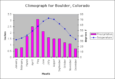
A climograph is a graph of monthly average temperature plotted against average humidity.  The monthly points are joined by lines while the shape and location indicate heat and humidity changes.  The above graoh does so for Boulder, Colorado.  

Windrose


Windrose refers to a compass subdivision from a meteorological standpoint.    

Triangular Plot


A triangle plot graphically depicts the ratios of the three variables as positions in an equilateral triangle.  The above triangle plots the percentage of each type of soil particle on the texture triangle.    

Parallel Coordinate Graph


The main GUI of the parallel coordinates consists of four main parts: 1st-  The main menu bar with basic controls; 2nd- a 3D parallel coordinate view; 3rd-  a 2D parallel coordinate view; and 4th- the bottom menu bar with additional controls.

Histogram


A histogram is a bar graph of a frequency in which the widths of the bars are proportional to the classes into which the variable has been divided and the heights of the bars are proportional to the class frequencies.  The above image displays the city population shifts of New York City.

Isoline Map


Isoline maps are a two dimensional representation of a three dimensional model.  The above map of the United States represents the average temperature between March 18th-24th in 2001 courtesy of the Climate Prediction Center.

Unclassed Choropleth Map


Choropleth maps produced with computers allow very gradual and subtle variations in colour.  Unclassed maps are easily produced through the use of shades of gray.  The symbolism is identical to that used in the non-continuous cartogram  but locational information is retained at the expense of symbol overlap.

Flow Map


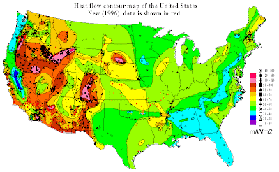
Flow maps in cartography are a mix of maps and flow charts that show the movement of objects from one location to another.  The above image of the United States is a great depiction as a heat flow contour map with more recent data (1996) shown in red.

Star Plot

http://lifeng.lamost.org/courses/astrotoday/CHAISSON/NAV/FRAMESET/FRAME17/IDX17-01.HTM

The above is a plot of the 30 closest stars to the Sun, projected so as to reveal their three-dimensional relationships. Notice that many are members of multiple-star systems. All lie within 4 pc (about 13 light years) of Earth.

Correlation Matrix


A correlation matrix is a square symmetric matrix in which the element in rox j and column k is equal to the correlation coefficient between random variables x of j and x of k.  The diagonal elements are each equal to 1.  The above image features the surface climate and streamflow variability in the western United States.

Similarity Matrix


A similarity matrix is a matrix of scores which express the similarity between two data points.  Similarity matrixes are strongly related to their counterparts and substitutes.  The above image shows the county bubbles in voting shifts between McCain and Obama during the presidential race in Pennsylvania.

Mental Map


A mental map is a map of the environment within the mind of the individual which reflects the knowledge of that individual.  Mental maps include images of locations as depicted in the image above.  

Box Plot


A box plot is a unique way of graphically depicting groups of numerical data through their five number summaries.  Boxplots display differences between populations without making any assumptions of the underlying statistical distribution.  The above box plot is a scatterplot result of the Maori population in Auckland, New Zealand.

Stem and Leaf Plot


A stem and leaf plot is a device for presenting quantitative data in a graphical format, similar to a histogram.
Step 1: In a stem-and-leaf plot, the number of data items is equal to the number of leaves present.   
Step 2: Number of leaves present in the above stem-and-leaf plot = 17.
Step 3: So, 17 data items are present in all.